

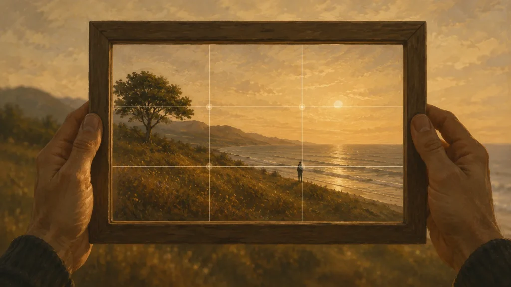
The grid is a prompt, not a rule. It works because it moves the subject off center and forces you to decide what the photo is about, which also explains the cases where centering is the better answer.
Switch on the grid in your camera app and you get two vertical lines and two horizontal ones, splitting the frame into nine rectangles. That grid is the rule of thirds, and the advice attached to it is usually one sentence: put your subject on a line or where two lines cross.
It is worth knowing. It also gets applied mechanically, to photographs it makes worse, when nobody explains what it is actually doing.
One Link for Everything You Shoot
A short address you control, pointing wherever your photos already live.
The Grid and the Claim
Divide the frame into thirds horizontally and vertically. You get four intersections. The rule says that placing your main subject on one of those intersections, or aligning a strong element along one of the lines, produces a more balanced photograph than centering it.
The honest version is narrower than that. Thirds is a convenient, repeatable way to get the subject off center. It is a heuristic that saves you from the default, not a law that governs good pictures.
Where it belongs: it is one technique inside the broader set covered in photographic composition. Useful on its own, better understood as part of that whole.
Why It Works When It Works
Two things are happening, and separating them is what lets you apply the rule with judgment.
It leaves room. A centered subject divides the frame symmetrically, which gives the eye nowhere particular to travel. Moving the subject off center creates a larger area and a smaller one, and the relationship between them is what the eye reads as context.
It forces a decision. The grid makes you ask which third the subject belongs in, and answering that means deciding what the photo is about. Asking the question is doing work the grid then gets credited for.
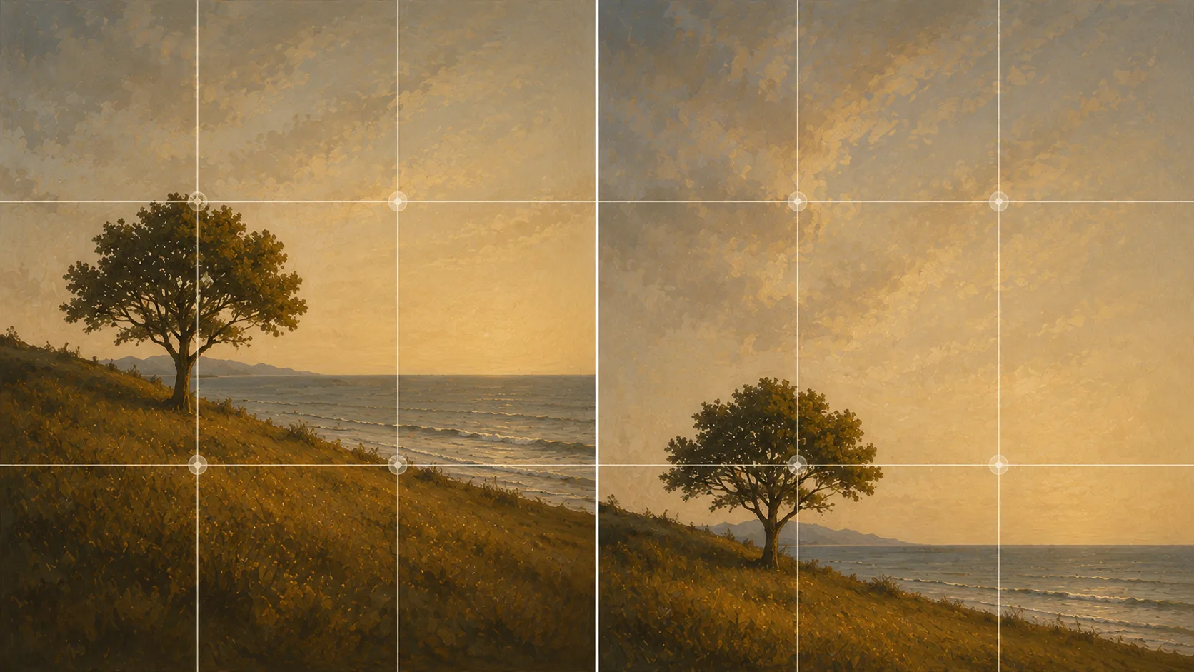
Neither mechanism depends on mathematics. The rule is sometimes justified by reference to the golden ratio, which is a separate proportion, arrived at differently, and not what a three-by-three grid produces.
Horizons and the Two-Thirds Decision
This is the clearest case for thirds. A horizon through the middle of the frame splits it evenly and gives the viewer no signal about which half matters.
Put the horizon on the lower line and you give two-thirds of the frame to the sky, which is the right choice when the sky is doing something: weather, color, cloud structure. Put it on the upper line and you give two-thirds to the ground, which is right when the foreground carries the interest.
The decision is not about the grid. It is about which half of the scene is the photograph, and the grid is just where you put the line once you have decided.
Check one thing before placement: whether the horizon is level. Unless the tilt is clearly deliberate, it reads as an error in a way that unconventional placement does not.
Eyes, Not Heads
One way to misapply the rule in portraits is putting the head on an intersection. Attention goes to the eyes, so the eyes are what should sit near the upper third line.
In a tight crop this puts the head above the line and partly out of the top of the frame, which feels wrong until you compare the two versions. Placing the whole head on an intersection leaves a large empty area above it.
Share the Set, Not Fifteen Links
Point one short address at your gallery, your socials, wherever the work already sits.
The same logic applies to animals and to any subject with a clear point of attention. Find the part the viewer will look at first, and place that, not the geometric center of the object.
Space in Front of Movement
A subject that is moving, or facing, in a particular direction wants space on that side. A runner placed on the right third moving right runs straight into the edge of the frame. Placed on the left third, they have somewhere to go.
The same applies to gaze. Someone looking off to the left wants the left side of the frame open. Crowd the direction they are looking and the photo feels blocked.
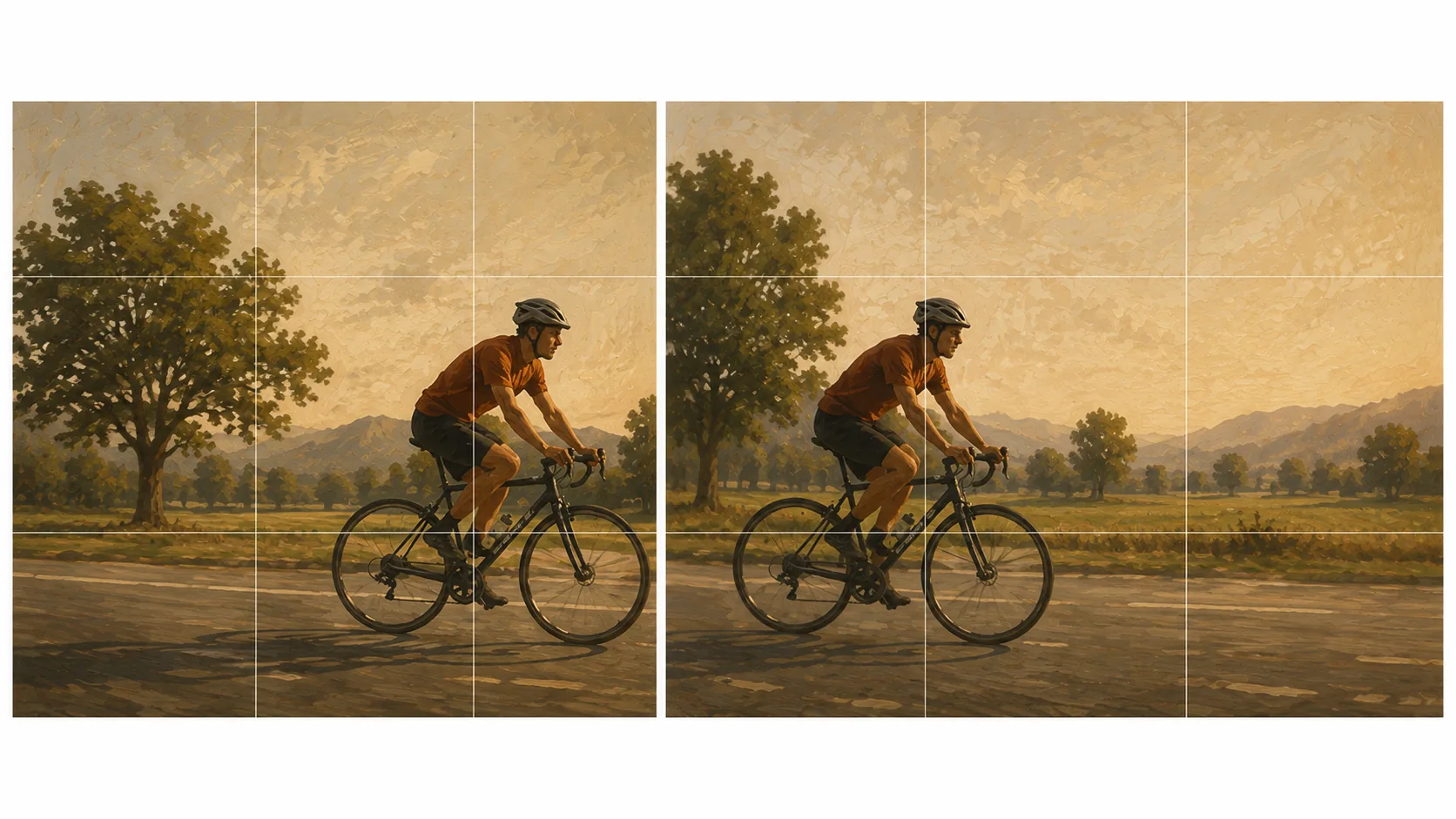
This is where thirds and intent can conflict. If the grid says one intersection and the direction of movement says the other, the direction wins. The rule is serving the photograph, not the other way around.
When Centering Is the Better Answer
Several situations where thirds actively hurts:
Symmetry. A reflection, a corridor, a face shot straight on, a building photographed square. The entire point is balance, and moving the subject off center destroys it.
Isolation. A single small subject in a large empty space can read strongest dead center, because the symmetry emphasizes how alone it is.
Very tight crops. When the subject fills most of the frame, there are no meaningful thirds left to place it on.
Patterns. Repeating elements across the whole frame have no single subject, so there is nothing to position.
The test is whether the placement serves what the photo is about. If centering says something the off-center version does not, center it. Following the grid regardless of subject produces technically compliant photographs with nothing to distinguish them.
Keep Your Photos in One Place
One address, updated whenever the work changes, with analytics on how often it gets opened.
Making It Automatic
If your phone or camera offers a grid overlay, turn it on and leave it on. Having it visible while you frame does the teaching for you.
Then a specific exercise: photograph the same subject three times, centered, on the left third, and on the right third. Do that for a week with different subjects. Comparing your own frames shows you when each placement works, which no explanation can do for you, including this one.
With repetition the grid stops being something you consult and becomes something you notice you have already used, or already decided against. That is the point at which it has done its job.
If you are still assembling the basics underneath this, the settings and habits it sits on are in our photography guide for beginners.
FAQ
Is the rule of thirds based on the golden ratio?
No. They are different proportions arrived at by different means. The rule of thirds is a simple approximation that is easy to apply in the field; the golden ratio is a separate mathematical relationship. The grid works because it moves the subject off center, not because of the math.
Should the subject be exactly on the intersection?
Near it is enough. The grid is a prompt for approximate placement, and forcing exact alignment can cost you the background or the moment.
Does it apply to video as well?
The same placement logic holds, and lead room matters throughout a shot rather than in a single frame, so a moving subject needs that space maintained as it travels.
Can I fix thirds by cropping later?
Sometimes. But cropping discards pixels and changes the relationship between subject and background, so the result is not identical to having framed it that way. Treat it as repair.
Why do my thirds photos still look wrong?
Check whether the placement is correct but the direction is not. A subject needs space on the side it faces or moves toward; correct placement into a blocked edge still reads as uncomfortable.
Is the grid something you keep using?
The judgment behind it outlasts the overlay. Once the habit of asking where the subject belongs becomes automatic, the visible grid has little left to add.