

Visual merchandising is one of the strongest conversion drivers in physical retail. It shapes how customers move, what they notice first, and what they ultimately buy. Good merchandising isn't decoration. It's a structured communication system.
The reality: most stores treat visual merchandising as an afterthought. Products sit on shelves in inventory order, lighting is generic, and signage is inconsistent. That setup leaves money on the table. Research shows well-executed visual merchandising can increase sales by 20-45% depending on category and store format. This guide covers the tactics that actually work.
Get Rewarded Every Time You Shop
Scan QR codes at your favorite stores and turn your attention into real rewards.
Quick video. Earn your first reward.
Why Visual Merchandising Directly Impacts Revenue
Customers make purchasing decisions based on what they see, how easy it is to navigate, and whether the environment feels comfortable. The mechanism is straightforward: when customers understand where to go and what to look at, they spend more time exploring. More exploration means more exposure to products. More exposure means more purchases.
Visual merchandising also reduces cognitive load. A cluttered store forces customers to work harder to find what they want. A well-organized store makes discovery feel effortless, which increases both conversion rate and average basket size.
If you're working on increasing foot traffic, remember that getting people through the door is only half the battle. Visual merchandising determines whether they stay, explore, and buy.
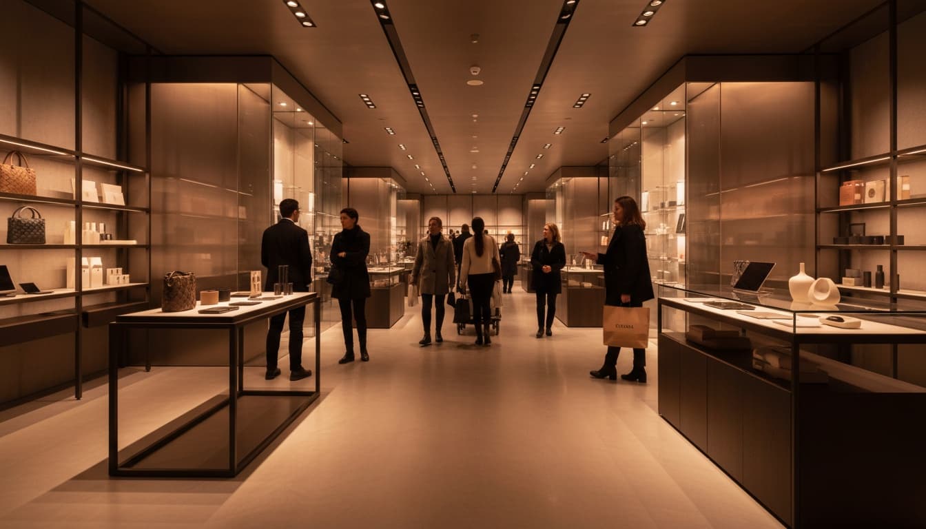
Build a Layout That Guides Customer Movement
Layout is the foundation of visual merchandising. It determines the path customers take, what they encounter first, and how much of the store they actually see. A poorly designed layout creates dead zones where products go unnoticed. A strong layout ensures every section gets traffic.
Retail behavior studies consistently show that customers who follow a predictable flow see more items and make more impulse purchases. The most effective layouts use wide entrance zones, strategic product placement, and subtle directional cues.
Core Layout Principles
Keep wide pathways at the entrance to reduce initial friction. Customers who feel crowded immediately after entering are more likely to leave quickly. The first few meters should feel open and inviting.
Use lighting and product blocks to pull customers deeper into the store. Eye-catching displays visible from the entrance create curiosity and draw people past the threshold zone.
Place new arrivals and hero products early in the customer journey. These items have the highest interest potential and set expectations for what else the store offers.
Use subtle curves rather than sharp angles to maintain flow. Curved pathways feel more natural and encourage continued exploration. Sharp corners create stopping points where customers might turn back.
Group Products by Intention and Narrative
Grouping is one of the most powerful ways to influence buying decisions. Customers don't think in categories the way inventory systems do. They think in outcomes, occasions, and stories. When products are grouped by purpose, color, lifestyle, or narrative, the brain processes them faster and buying feels effortless.
When items are presented together in a coherent way, customers perceive them as belonging together. This creates natural cross-sell opportunities because the grouping itself suggests these items complement each other.
High-Converting Group Types
Color-coordinated displays create visual harmony that attracts attention from across the store. A wall or table organized by a single color family becomes a destination point.
Solution-based groupings answer specific customer questions. Complete outfits, meal kits, gift sets, or project bundles reduce the work customers need to do. Instead of hunting for individual items, they find a ready-made answer.
Feature-focused tables highlight what makes products special. This could be materials, newness, or values like sustainability. These groupings attract customers who care about specific attributes.
Price tier tables simplify comparisons. When customers can see all options at a specific price point, they make decisions faster and with more confidence.
Turn Your Shopping Into Earnings
VISU rewards you for engaging with brands you already love. Scan, shop, earn.
Quick video. Earn your first reward.
Use Lighting to Highlight Products and Guide Attention
Lighting is one of the highest-impact elements in visual merchandising, yet it's often overlooked. It affects mood, shapes perception of quality, and directs customer attention without them consciously noticing. Studies from retail environments show that well-lit product zones increase engagement by up to 30% compared to ambient lighting alone.
The key insight is that lighting creates hierarchy. Bright areas attract attention. Darker areas recede. By controlling light intensity across the store, you control where customers look.
Strategic Lighting Techniques
Place spotlights on premium or high-margin items. The additional light makes these products stand out and creates a perception of importance.
Use warm light for lifestyle and fashion displays. Warm tones create comfort and emotional connection, which supports purchasing decisions for personal items.
Use cooler light for technology or precision items. Cooler tones suggest clarity and accuracy, which aligns with customer expectations for these categories.
Create contrast zones where light intensity highlights what matters most. A brightly lit display against a slightly dimmer background focuses attention and reduces distraction.

Good lighting not only boosts conversion but creates emotional anchors. Customers remember how the space made them feel, which increases the likelihood of return visits. For more on creating memorable shopping environments, see in-store experiences that drive sales.
Use Signage That Communicates Value Clearly
Signage is the language of retail. It bridges the gap between what the store offers and what customers understand. When signage is clear, customers immediately grasp pricing, benefits, categories, and ways to engage. When signage is confusing or inconsistent, customers hesitate and leave without exploring.
Effective signage follows the principle of progressive disclosure. The most important information comes first and is visible from a distance. Secondary details are available for customers who move closer.
Best Practices for Retail Signage
Use short and direct headlines. Customers scan signs in seconds. Long explanations get ignored.
Choose fonts large enough to be readable from the typical viewing distance for that location. Floor signs need larger fonts than shelf tags.
Maintain consistent visual style across all zones. Inconsistent signage creates a fragmented experience that undermines trust.
Highlight the most important detail first. If price is the key message, make it the largest element. If the benefit is primary, lead with that.
Link signage to digital actions using QR codes. Signs like "Scan to compare," "Scan for styling tips," or "Scan to unlock a reward" connect the physical display to digital value.
Incorporate Sensory Cues to Improve Exploration
Sensory cues create emotional memory. When the environment feels good, customers stay longer and explore more categories. Sensory merchandising uses lighting, scent, sound, texture, and micro-ambiance to shape the overall experience.
Multiple sensory inputs create richer memories and stronger emotional associations. A store that engages multiple senses feels more substantial and trustworthy than one that relies on visuals alone.
Examples of Effective Sensory Cues
Warm ambient lighting near relaxation-focused zones creates comfort and encourages browsing rather than rushing.
Soft background music matched with store identity sets emotional tone. The tempo affects movement speed: slower music encourages longer visits.
Natural scents in lifestyle sections like home or beauty create authenticity and sensory pleasure. Scent is particularly powerful because it connects directly to memory and emotion.
Texture-based displays that encourage touch increase engagement. When customers physically interact with products, they form stronger connections and are more likely to buy.

Add Mobile Interactions to Make Displays Dynamic
Mobile touchpoints transform static displays into living experiences. QR codes allow customers to unlock additional content, compare products, join challenges, or receive micro-rewards. This turns visual merchandising into an active engagement system instead of a passive presentation.
The advantage of mobile integration is that it meets customers where they already are. Most shoppers carry smartphones. Giving them reasons to use those devices in-store creates a bridge between physical browsing and digital information.
Examples of Mobile-Enhanced Merchandising
Scan to watch a short demo. Video content explains product benefits more effectively than text, especially for complex or technical items.
Scan to see styling ideas or recipes. This type of content helps customers imagine products in their own lives, which increases purchase confidence.
Scan to unlock a micro-reward for discovering the item. Gamification elements create positive associations and encourage exploration of less-visited store areas.
Scan to join a seasonal or in-store mission. Multi-step engagement creates reasons to return and builds longer-term relationships.
These interactions reduce confusion and increase confidence. Customers appreciate having access to information without needing to find a staff member. For more on building these journeys, see our gamification marketing guide.
Practical Merchandising Examples You Can Apply Today
Below are specific setups that stores of any size can implement without redesigning the entire space.
Color-Based Storytelling Wall
Group products by a single color family to create a visually striking focal point. This works well for fashion, home décor, cosmetics, and seasonal products. The color cohesion makes scanning the display effortless and draws customers into deeper exploration.
Solution Table for Common Needs
Create a table that solves a specific customer problem or theme. Examples include "back to work essentials," "home spa night," "weekend camping kit," or "first apartment basics." This helps customers understand how products fit into their lifestyle and increases multi-item purchases.
Demo Station With QR-Connected Tutorial
Set up a small hands-on area where customers can test a product. A QR code next to the demo leads to a short video explaining how to use it effectively. This combination of physical experience and digital guidance increases confidence and reduces hesitation.
Cross-Category Bundle Display
Create small bundles with complementary products from different categories. Cooking kits, self-care sets, gift combinations, or hobby starter packs are all effective formats. Highlight them with clear signage and a QR code that unlocks a micro-reward for choosing the bundle.
Visual merchandising becomes most powerful when it integrates layout, emotion, structure, and interactivity. The goal is to create a store where customers understand what to do, where to go, and why a product matters, all without needing to ask.
If you're looking to tie visual merchandising into broader retail strategy, explore best retail promotions and learn how to compete with Amazon as a local store.
Transform Your Merchandising With Interactive Experiences
Use sensory design, structured layouts, and QR-powered digital moments to increase engagement and sales inside your store.
FAQ: Visual Merchandising Tips
What is the most important element of visual merchandising?
Layout and product grouping form the foundation. They determine how customers move through the space, what they see first, and how much of your inventory gets exposure. Without a strong layout, other elements like lighting and signage have limited impact.
Does lighting really affect sales?
Yes, significantly. Lighting influences mood, attention, and perception of product quality. Well-lit areas consistently generate higher engagement and conversions than dimly lit zones. Strategic lighting also creates visual hierarchy that guides customers toward priority products.
How can QR codes improve visual merchandising?
QR codes add an interactive layer to static displays. Customers can scan for product demos, comparisons, styling ideas, or rewards. This transforms passive browsing into active engagement and provides data about which displays attract the most interest.
How often should I change visual merchandising?
Update key areas every two to four weeks depending on new arrivals, campaigns, and seasonal shifts. Regular changes keep the store feeling fresh for repeat customers. Even small changes to featured displays can maintain novelty without requiring complete redesigns.
What's the difference between visual merchandising and store design?
Store design refers to permanent architectural elements: fixtures, flooring, ceiling height, overall layout structure. Visual merchandising is the layer on top: how products are displayed, grouped, lit, and signed within that structure. Visual merchandising can change frequently, while store design requires significant investment to modify.
Can small stores benefit from visual merchandising?
Absolutely. Small stores often benefit more because every square meter matters. Thoughtful grouping, clear signage, and strategic lighting can make a compact space feel organized and premium. Limited space also simplifies testing: changes are easier to implement and results are easier to measure.