

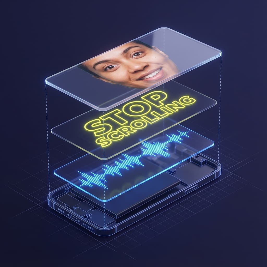
You just made a decision about this article in roughly 3 seconds. Your brain scanned the title, evaluated the opening words, checked the layout, and unconsciously decided: "Read this" or "Skip this". If you are reading this sentence, the hook won a tiny attention battle in your feed.
Scale that up. If 100 people see this article, 60 to 80 will already have scrolled past before reaching this paragraph. Their brains rejected the attention request in under 3 seconds and moved on to the next stimulus competing for cognitive bandwidth.
That tiny window decides if your ad gets watched, if your Reel gets a full view, if your landing page ever has a chance to convert. Creators think in terms of video length and post frequency. Brands think in terms of budget and impressions. The attention economy cares about one thing first: what happens in those first 3 seconds. And the truth is simple: your attention has real value.
The Attention Crisis is Real and Measurable
The statistics paint a stark picture. In 2000 the average human attention span was often cited around 12 seconds. By the mid 2020s it is usually estimated in the 6 to 8 second range. You can argue with the exact methodology, but you cannot ignore the lived reality: people decide faster, scroll faster, and abandon faster.
On social feeds the decision window is even shorter. Most users are not reading deeply or evaluating carefully. They are flicking through a stack of micro decisions: "Worth my time?" or "Next". In that mode, anything confusing, visually weak, or slow to start is treated as noise.
| Platform | Decision Window | Primary Action |
|---|---|---|
| TikTok | ~1.7 Seconds | Scroll or Watch |
| Instagram Reels | ~2.1 Seconds | Scroll or Watch |
| YouTube | 3 - 5 Seconds | Click Thumbnail |
| Email Inbox | ~2.8 Seconds | Open or Delete |
If your hooks are weak you are not just losing a bit of engagement. You are burning reach, budget, and creative effort before your content even has a chance to demonstrate value. Improving the first 3 seconds is often the highest leverage optimization a creator or brand can make.
This shift explains why more users are looking for apps that pay real money by rewarding attention instead of interrupting it.
Table of Contents
This guide breaks the 3 second rule into practical systems you can apply immediately. You will see what the brain is doing in those first moments, which visual and audio triggers work, how to write hooks that do not feel like clickbait, and how to measure improvement over time.
The Neuroscience of the First 3 Seconds
Understanding what happens in the brain during those critical first moments explains why some content looks "sticky" and most gets ignored. Your audience is not lazy or cruel. Their brain is running a filtering system designed to protect limited energy and avoid overload.
0 - 0.5 Seconds: Pre Attentive Processing
Before anyone consciously decides anything, the visual system does a rapid scan. The brain checks for color, motion, contrast, faces, and basic shapes. This process is fast and automatic. It evolved to detect threats and opportunities in the environment.
In this phase the viewer is not reading sentences or evaluating ideas. They are reacting to patterns. A face facing the camera, a moving hand, a bold block of color, or a large number on screen can all register before a single word is processed.
0.5 - 1.5 Seconds: Pattern Matching
Next the brain does a quick comparison: "Have I seen something like this before?" If the visual looks like every other piece of content in the feed, the pattern feels generic and gets filtered out. Novel combinations, unusual framing, or strong emotional expressions disrupt this autopilot.
1.5 - 3 Seconds: Relevance Assessment
The prefrontal cortex starts to ask unconscious questions:
- "Will this help me?" (Utility: money, time, health, relationships)
- "Will this entertain me?" (Pleasure: dopamine, humor, surprise)
- "Is this safe and trustworthy?" (Safety: no scam, no spam)
If the answer feels like "yes" or "this might be useful", the viewer sticks around. If the answer is "maybe" or "not sure", the brain defaults to energy conservation: scroll.
3 - 10 Seconds: Commitment or Exit
Once someone stays past the initial gate you have a short second window where they decide whether to fully commit. This is where your promise needs to move into delivery. A strong opening line, a quick preview of the payoff, or a mini result screenshot helps justify staying longer.

Visual Attention Triggers: The 12 Elements That Capture Eyes
Visual information travels to the brain far faster than text. That is why three seconds of well designed visuals can outperform thirty seconds of brilliant copy. Use these triggers deliberately instead of hoping the algorithm "likes" your post.
Trigger #1: Human Faces (Strongest)
The fusiform face area in the brain processes faces faster than almost anything else. Direct eye contact activates social brain networks and instantly signals "this matters to me". Creators who put their face in the first frame tend to see 40 to 60 percent higher engagement.
Trigger #2: Motion (Automatic)
Movement triggers automatic attention because it historically meant "predator or opportunity". In video you should be moving immediately: walking, turning, raising your hand, changing the object in frame. In static visuals use implied motion like angled shapes or motion blur.
Trigger #3: High Contrast
High contrast makes your content pop against the feed. Think light text on a dark background, or a bright subject against a muted environment. It acts as a pattern interrupt. VISU style neon gradients on dark surfaces are a classic example of contrast that reads instantly on mobile.
Trigger #4: Unexpected Elements
The brain loves patterns but pays special attention to broken ones. A QR code in a place you would not expect, a person in formal clothes at a skate park, or a huge number floating next to a tiny object creates enough curiosity to delay the scroll.
Creator Hack: The Text Overlay
Most social video is watched without sound. Always add a big, readable text overlay in the very first frame that summarizes the value: "I earned $147 today", "How I paid my rent with QR codes", or "Stop scrolling if you want more grocery money".
Trigger #5: Text Overlays (Direct Clarity)
Text removes ambiguity. A viewer should know in one glance why they should care. Use a short value proposition in 5 to 7 words such as "Turn receipts into cash in 2 minutes". Tests across multiple channels usually show strong overlays increasing completion rates and link clicks.
Trigger #6: Bright or Saturated Colors
Saturated colors stand out inside neutral feeds full of beige walls, grey interfaces, and low light selfies. VISU creators often use purple and cyan gradients to signal "reward content" at a glance so that frequent viewers start to recognize the visual code.
Trigger #7: Large Objects and Text
Most people are watching on small screens at arm length. Tiny details get lost. The main object or number should be clearly visible even if the viewer squints. A big "$5.25 earned from one grocery run" on screen is easier to process than a cluttered layout with five different messages.
Trigger #8: Directional Cues
Humans instinctively follow arrows, hands, and gaze. If you look toward your VISU QR code, the viewer will look at it too. Add a simple arrow or circle to reinforce where the eye should go next.
Trigger #9: Clean Framing and Whitespace
A busy, cluttered frame forces the brain to work harder. Clean backgrounds and generous whitespace around your main element make the decision easier. Minimalism can be just as powerful as loud design when the message is strong.
Trigger #10: Numbers and Progress
Numbers feel concrete. "3 second rule", "7 hooks that always work", or "Day 14 of my QR challenge" all give the brain something to latch onto. Progress bars, streak counters, or level indicators also tell a tiny visual story about movement over time.
Trigger #11: Before and After Contrast
A split screen that shows "before VISU" and "after VISU" or "generic receipt" vs "receipt with earnings" instantly communicates transformation. The viewer does not need to read a paragraph to understand that something improved.
Trigger #12: On Screen Countdowns
A subtle countdown like "3 tips in 15 seconds" or a ticking progress ring increases urgency. The viewer subconsciously thinks "I can stay for that long" and is more likely to watch until the payoff.
Auditory Attention Hooks for Video
Even though a large share of social video is consumed with sound off, audio still matters. For people watching with headphones or speakers on, the first second of sound can double down on the visual hook.
- Volume Contrast: Starting with a slightly louder "Wait, do not scroll" or an unusually soft whisper breaks the ambient noise pattern.
- Recognizable Sounds: A cash register "cha ching", notification ding, or scanner beep instantly hints at money, messages, or rewards.
- Pattern Breaking Pauses: A one second silence right after a bold line like "You are throwing away money every week" creates tension that demands resolution.
For VISU creators a simple audio structure works well: one short pattern interrupt line, one plain language promise, then immediate proof. Example: "Stop. You are paying full price for coffee. I paid 2 dollars less using this QR code. Look." Then cut to the scan and the reward screen.
Textual Mechanics: Headlines & Opening Lines
On platforms where text is the first touch point - email, blog, push notification, SMS - your words do the job that faces and motion do in video. Strong headlines filter in the right people without tricking them.
Framework #1: The Curiosity Gap
Structure: Known Setup + Hidden Explanation + Clear Promise
Example: "I earned 147 dollars last month without a traditional job. Here is the exact system I used with QR codes."
Framework #2: Specificity Signals Credibility
Specific numbers and concrete time frames feel truthful. Vague claims feel like generic marketing.
Weak: "Earn money fast."
Stronger: "Earn 0.50 dollars in under 2 minutes by scanning your first code."
Framework #3: The How To Promise
People are wired to click on instructions that clearly improve their life. "How to turn your grocery receipt into cash" is more compelling than "New app launched".
Framework #4: Mistake and Warning Hooks
Highlighting a common error can spark instant self reflection.
Example: "The 3 second mistake that kills your Reels" or "Stop putting this sentence in your bio if you want clicks".
Framework #5: Transformation in One Line
Show the starting point and the desired future in a single sentence.
Example: "From scrolling to earning: how I turned bus rides into a side income with VISU."
Platform Specific 3 Second Strategies
The 3 second rule applies everywhere, but the way you design hooks should adapt to how people naturally use each app.
TikTok (1.7 Second Window)
Context: Fastest scroll speed and constant competing sounds.
Strategy: Aggressive visual overload: face in frame, big text, and motion in the first half second. Cut out any intro that sounds like "Hi guys, welcome back". Start mid action: "Here is how I made 5 dollars in this supermarket" while already walking into the store.
Instagram Reels and Stories
Context: Users are used to personal, handheld content.
Strategy: Use selfie framing plus on screen text. For Stories add a sticker such as a poll or link after the first few seconds so the interaction feels natural. For Reels, pin your VISU hook as text in the top third of the frame where the caption does not cover it.
YouTube (Thumbnail and First 3 Seconds)
Context: The decision happens before the video even starts.
Thumbnail Strategy: Combine a clear facial expression (surprise, relief, shock) with three or fewer words: "Side hustle math", "Scan and earn", "3 second rule".
Opening Strategy: Repeat the promise out loud and on screen, then immediately jump to a visual proof such as a dashboard, payout, or real world scan.
Email and Notifications
Context: Competing against dozens of messages in a cramped screen.
Subject Strategy: Front load the benefit. Put the most important word in the first five words.
Winner: "You earned 5 dollars from scanning" vs Loser: "Update regarding your account balance"
VISU Creator Strategy
When promoting your referral or VISU Link, lead with an "earnings reveal" hook. Start the video with a screen recording or green screen of your VISU dashboard showing real income. Then explain what viewers have to do in one sentence. This combination of proof plus simple instruction stops the scroll far more often than abstract promises.
Testing, Measuring, and Optimizing
Strong hooks are not a one time creative breakthrough. They are the result of iterative testing. The difference between an account that grows steadily and one that flatlines is often how seriously the creator treats data from the first 3 seconds.
Key Metrics to Track
| Metric | Formula | Benchmark (Good) |
|---|---|---|
| Capture Rate | Engaged Viewers / Impressions | 15 - 25% |
| 3 Second Retention | Viewers still watching at 0:03 | 60%+ |
| Click Through | Link Clicks / Views | 2 - 5% |
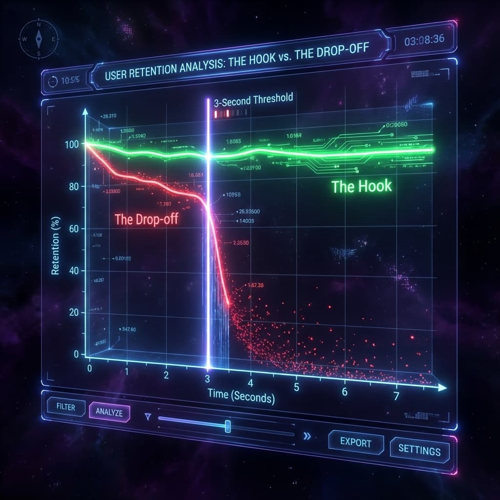
Most platforms now show a retention graph. Look at where the sharpest drop happens. If you lose half your viewers in the first 2 seconds, you have a hook problem. If the drop happens at 8 to 10 seconds, your promise was good but your delivery or pacing fell flat.
For VISU focused content you can also track downstream metrics: QR scans, VISU Link clicks, new app installs, and completed missions. The best hook is not just the one with the highest view count, but the one that sends the most people into your earning funnel.
The A/B Testing Protocol
Instead of changing everything at once, test one variable at a time so you know what caused the improvement.
- Week 1: Test visuals (face vs text only, dark vs bright background).
- Week 2: Test headlines (question vs statement, curiosity vs direct benefit).
- Week 3: Test audio (trending sound vs original voice vs silence with strong text overlay).
Ethical Hooks vs Clickbait
There is a thin line between a strong hook and dishonest bait. Crossing it might give you one viral spike, but it destroys long term trust and hurts your brand just when attention is hardest to win.
- Clickbait: Maximizes initial clicks through exaggerated or misleading claims like "I made 10k today doing nothing" and then fails to deliver. The result is high churn, angry comments, and people swiping away faster next time your content appears.
- Ethical Hook: Maximizes interest through curiosity or bold statements while telling the truth: "Here is exactly how I earned 147 dollars last month scanning QR codes during errands" and then showing the method step by step.
VISU encourages transparency. Show real numbers, explain the real work, and be honest about limits. Short term tricks might boost a single metric, but honest hooks build a community that trusts you when you recommend campaigns, missions, or products.
Future of the 3 Second Rule (2026+)
As AI generated content floods every feed, generic, polished posts will become background noise. The elements that stand out will shift even more toward authenticity: real faces, real screens, small imperfections, and honest stories.
The window itself may get even tighter. As more apps compete for the same attention, people will develop faster filters. Designing for clarity, simplicity, and immediate payoff will not be a nice touch. It will be mandatory.
Your 3 Second Action Plan
- Audit Today: Look at your last 10 posts on any platform. Ask a ruthless question: "Would I stop for this in my own feed?" Note how many start with a clear hook in the first 3 seconds.
- Implement Tomorrow: Create one new piece of content where you deliberately apply at least three visual triggers from this guide plus a strong on screen text overlay.
- Test Weekly: Track 3 second retention and click through for that content type. If numbers improve, repeat and scale that style. If they do not, adjust one variable and test again.
As attention becomes measurable and monetizable, platforms that reward user actions are gaining relevance. This is where attention based earning apps start to outperform traditional ad models.
Turn Attention Into Assets
Now that you know how to capture attention, put it to work. Join VISU to earn rewards for your focus or use VISU tools to build a passive income stream from your audience.
Frequently Asked Questions
Is the attention span really only 8 seconds?
Many studies suggest the average human attention span for digital content has dropped from around 12 seconds in 2000 to under 10 seconds today. For content decisions like scroll or stay, the real window is usually closer to 1.7 to 3 seconds, especially on mobile feeds.
Does text on screen really help?
Yes. Because a large share of social media is consumed without sound, text overlays are often the only way to communicate value in the first seconds. They also support people who watch with low volume or in noisy environments.
What is the best color for attention?
There is no universal best color, but contrast is critical. Bright colors like neon green, yellow, or hot pink against dark backgrounds tend to grab attention fast. Your brand should choose a consistent palette that both stands out and feels on brand.
How do I fix a low retention rate?
If viewers drop off before 3 seconds, you need a stronger hook: clearer visuals, better text overlay, or a more interesting opening line. If they drop off after 10 seconds, focus on delivery, pacing, and how quickly you reveal value. Use analytics to find the exact second where people leave and redesign that part.